Control Charts
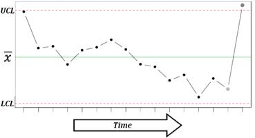
The control chart is a graph that represents the variability of a process variable over time. Control charts are used to determine whether a process is in a state of statistical control, to find the causes of changes in a process, and monitor process performance. Control charts are also known as Shewhart control charts, after W.A. Shewhart (1931) who first introduced the concept.
A control chart consists of:
· A center line, drawn as a green line at the mean value for the in-control process (stable zone).
·
Upper and lower control limits (UCL and LCL) – red lines.
These control limits are chosen so that almost all of the data points will fall
within these limits as long as the process remains in-control. Control limits are
set at a distance of three sigma 3![]() (standard
deviation) above and below the mean centerline. Default distance (3
(standard
deviation) above and below the mean centerline. Default distance (3![]() ) can be
overwritten using the “Control limits at these
multiples of standard deviations” option.
) can be
overwritten using the “Control limits at these
multiples of standard deviations” option.
· Data points representing a statistic for a subgroup (mean, range, proportion) or an attribute. A point outside the control limits indicates the presence of a special cause that deserves investigation.
There are two basic types of control charts – control charts for attributes and control charts for variables. Following types of control charts are available:
Individuals and moving range charts
Control charts for subgroup averages
·
X-bar ![]() chart
chart
· R chart
· s chart
Time weighted control charts
· CUSUM chart
Control charts for attributes
· P chart
· C chart
· U chart
X-bar chart
X-bar ![]() chart is used
to monitor the mean value of a process over time (between-sample variability).
For each subgroup, the mean value is plotted.
chart is used
to monitor the mean value of a process over time (between-sample variability).
For each subgroup, the mean value is plotted.
Run: Charts→[Control Charts] X-bar and R Chart or X-bar and S Chart command.
Input variables: please see the Data layout for Xbar-R and Xbar-S charts section below for more details.
R chart
R chart is used to monitor the instantaneous process variability
at a given time (within-sample variability). Standard deviation, approximated
by the sample range is used as a measure of variability – for each subgroup,
the range ![]() is plotted. R
charts are usually used when we have a constant and relatively small sample
size (N=2…15). R chart can be produced for subgroups with a sample size up to
50.
is plotted. R
charts are usually used when we have a constant and relatively small sample
size (N=2…15). R chart can be produced for subgroups with a sample size up to
50.
Run: Charts→[Control Charts] X-bar and R Chart command.
Input variables: please see the Data layout for Xbar-R and Xbar-S charts section below for more details.
Methods
The default (Rbar) estimate
for sigma is ![]() , where K is
the number of subgroups,
, where K is
the number of subgroups, ![]() is the
unbiasing factor. Minimum variance linear unbiased estimate can be selected
from the Advanced Options [v6.5+].
is the
unbiasing factor. Minimum variance linear unbiased estimate can be selected
from the Advanced Options [v6.5+].
S chart
S chart is similar to R chart, but the standard deviation is directly estimated. S charts are preferable when a sample size is a variable or moderately large (N>10).
Run: Charts→[Control Charts] X-bar and s Chart command.
Input variables: please see the Data layout for Xbar-R and Xbar-S charts section below for more details.
Methods
The default (Sbar) estimate
for sigma is ![]() , where K
is the number of subgroups,
, where K
is the number of subgroups, ![]() is the
unbiasing factor.
is the
unbiasing factor.
Data layout for Xbar-R and Xbar-S charts
Use the Data layout option to select how your data is organized.
|
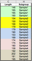
1. Subgroups are defined by values of the Group variable
Select the Length variable as Measurements and the Subgroup variable as (Data Layout #1) Group. This layout allows using subgroups with unequal sizes. |
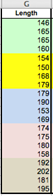
2. Single column with measurements, fixed subgroup size
Select the Length variable as Measurements and enter 4 to the (Data Layout #2) Subgroup Size field. |
|
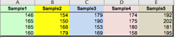
3. Subgroups across the columns, each column represents a subgroup
Select the Sample1–Sample5 variables (columns A:E) as Measurements. This layout allows using subgroups with unequal sizes. |
4. Subgroups across the rows, each row represents a subgroup
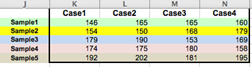
Select the Case1–Case4 variables (columns K:N) as Measurements. |
Workbook with samples is available through the Dataset link at the top of this page.
CUSUM chart
CUSUM chart (cumulative sum
control chart) is used for change detection monitoring. While control charts
for subgroup averages (X-bar, R and S charts) use information only from the
last sample and can detect process changes greater than ![]() , CUSUM chart,
introduced by (Page, 1954), uses information given by the entire sequence of samples
and thus can detect smaller shifts and maintain tight control over a process.
CUSUM is one of the most powerful management tools available for the detection
of trends and slight changes in data.
, CUSUM chart,
introduced by (Page, 1954), uses information given by the entire sequence of samples
and thus can detect smaller shifts and maintain tight control over a process.
CUSUM is one of the most powerful management tools available for the detection
of trends and slight changes in data.
The cumulative sum of the deviations between each data point (a sample mean) and a reference value – target (T), is plotted. For the rth sample the cumulative sum is defined as:
![]() , where T is
the target. The choice of the T value depends on the application of the
technique. Upper and lower control limits are computed as follows:
, where T is
the target. The choice of the T value depends on the application of the
technique. Upper and lower control limits are computed as follows:
![]() .
.
Allowance K is often chosen about halfway between the target T and the out-of-control value of the mean that we are interested in detecting.
Run: Charts→[Control Charts] CUSUM Chart command.
Select a variable with group codes and a variable with measurements.
Specify the target or
check the “Auto Select Target” option to use
the grand mean as the target estimate. A grand mean is calculated as ![]() .
.
Specify the decision interval H (control limits). Default value of H is 4.
Specify the allowance K (also known as a slack value). Default value of K is 0.5, to detect one-sigma shifts in the mean.
Specifies which subgroup to center the V-mask on. The subgroups have indices starting from 1. Leave the default value – zero, to use the last subgroup.
P chart
P chart is used to monitor the proportion of defectives in a
process. The sample fraction nonconforming (proportion of defectives) is
defined as the ratio of the number of nonconforming units ![]() to the sample
size
to the sample
size ![]() :
: ![]() . The random
variable
. The random
variable ![]() follows binomial
distribution. The mean of
follows binomial
distribution. The mean of ![]() is
is ![]() and the
variance of
and the
variance of ![]() is
is ![]() . The control
limits are defined as
. The control
limits are defined as
![]() .
.
Run: Charts→[Control Charts] P Chart command.
Select a variable with subgroups sample size and a variable with defectives count (measurements) for each subgroup.
If the true fraction conforming p is known – specify the target value. When p is not known it is estimated with the grand mean.
C chart
C chart is used to monitor
the total number of nonconformities per unit ![]() . Unlike the P chart, the C chart allows having more
than one nonconformity per inspection unit, and requires a fixed sample size. The
random variable
. Unlike the P chart, the C chart allows having more
than one nonconformity per inspection unit, and requires a fixed sample size. The
random variable ![]() follows
Poisson distribution.
follows
Poisson distribution.
Center line is defined as ![]() . It is estimated as the observed
average number of nonconformities (grand mean), and control limits are
defined as
. It is estimated as the observed
average number of nonconformities (grand mean), and control limits are
defined as ![]() , where
, where ![]() is set to 3 by default. If the lower
control limit is negative, then there is no lower control limit.
is set to 3 by default. If the lower
control limit is negative, then there is no lower control limit.
Run: Charts→[Control Charts] C Chart command.
Select a variable with measurements (number of nonconformities per unit).
U chart
U chart is used to monitor the average number of
nonconformities per unit ![]() . With U chart we
can have several inspection units in a sample. Center line is defined as
. With U chart we
can have several inspection units in a sample. Center line is defined as ![]() .
.
Run: Charts→[Control Charts] U Chart command.
Select a variable with subgroups sample size and a variable with defectives count (measurements) for each subgroup.
Individuals and moving range I-MR charts
Individuals control chart (I chart)
is used for process monitoring based on individual observations. The center
line represents an estimate of the process average (when unspecified, the
average of all the observations, grand mean, is used), and points on the
chart are the individual values. Control limits
are defined as ![]() , where
, where ![]() is an average of the moving ranges,
is an average of the moving ranges, ![]() is the
unbiasing factor and
is the
unbiasing factor and ![]() is set to 3 by default. Individual charts are
less sensitive (i.e., less powerful) than Xbar and R charts, and the assumption
of normality is more critical (deviations from normality may lead to elevated
rate of false alarms).
is set to 3 by default. Individual charts are
less sensitive (i.e., less powerful) than Xbar and R charts, and the assumption
of normality is more critical (deviations from normality may lead to elevated
rate of false alarms).
Moving range chart (MR chart)
monitors the between variation over time. Moving ranges represent point‑to‑point
variation and are defined as the absolute differences between consecutive
points. The number of points used to calculate a moving range is the moving
range length or span. For the default span value of two, ![]() are defined as
are defined as ![]() . Points on the
chart are moving ranges
. Points on the
chart are moving ranges ![]() and the center line is an average of the moving ranges
and the center line is an average of the moving ranges ![]() . Control limits
are defined as
. Control limits
are defined as ![]() (
(![]() is set to 3 by default). Moving range chart may show cycles
or pattern of runs induced by correlation of moving ranges (Montgomery,
2005) and thus should be treated cautiously.
is set to 3 by default). Moving range chart may show cycles
or pattern of runs induced by correlation of moving ranges (Montgomery,
2005) and thus should be treated cautiously.
Run: Charts→[Control Charts] Individuals and Moving Range command.
Select a variable with measurements.
Optionally, change the method of estimating sigma.
References
Montgomery, D. (2005). Introduction to Statistical Quality Control. Hoboken, New Jersey: John Wiley & Sons, Inc.
Oakland, J. (2007). Statistical Process Control, 6th edition. Butterworth-Heinemann.
Page, E. S. (1954). "Continuous Inspection Scheme". Biometrika. 41 (1/2): 100–115.
Shewhart, W.A. (1931). Economic Control of Quality of Manufactured Products. Van Nostrand, New York and MacMillan, London (501 pages).
Wheeler, D. J. (2010). Individuals Charts Done Right and Wrong, Quality Digest.