Get Started
Quick start guides for each platform.
Datasets
- ANOVA - Factors
- Anscombe's Quartet
- Control Charts
- Data sample - Conditional
- Frequency Tables
- HI LEP Population Profile
- Fisher's Iris
- Nonparametric - 2x2 Tables
- Nonparametric - Chi-Square
- Nonparametric - Cochran Q
- Pearson Correlation
- Regression - Polynomial
- Road Safety
- Stacked and unstacked data
- Survival - Cox Regression
- Survival - ProbitAnalysis
- US GDP data (Time Series - Autocorrelation)
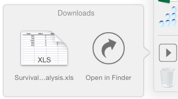
Click on a file to save it to your Downloads folder or open in the StatPlus app.
What's New
Help:
- Some articles include a workbook with example, step-by-step tutorial and PDF version.